9 Week 8: PCAs & Mosquitos
We will be using an Aedes aegypti mosquito population genomic data to create PCAs.
This data is from a paper by Rose et al. (2020) titled [“Climate and Urbanization Drive Mosquito Preference for Humans”] https://www.cell.com/current-biology/fulltext/S0960-9822(20)30978-7?referringSource=articleShare

Photo by Muhammad Karim: https://en.wikipedia.org/wiki/User:Muhammad_Mahdi_Karim
These samples were taken across Central Africa, shown in the figure below. Ae. aegypti has only 3 chromosomes, but the raw dataset is quite large, so we have subsetted the vcf file from this study to contain only the first chromosome. We will use this subsetted vcf to create a principal component analysis (PCA) and learn how to visualize variation in this dataset.
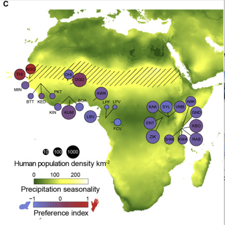
Rose et al. (2020) Map of collection sites. Diagonal hatched lines mark the Sahel ecoclimatic zone.
9.1 Main Objectives:
- Interpret a principal component analysis (PCA) plot
- Visualize population genomic data by creating a PCA in R
9.2 Warmup: Getting Acquainted with PCAs
First, we’ll go through a mini lecture together to introduce PCAs. You can follow along with the slides here.
Next, take a few minutes to read through and play around with the interactive options on this website, which explains the logic behind Principal Component Analysis.
9.3 Download the data in terminal
We first need to download the data in terminal. So start an OnDemand session, navigate to your directory and run the following commansd to get the vcf file.
cd /group/rbaygrp/eve198-genomics/yourdirectory
wget https://raw.githubusercontent.com/mlarmstrong/IntroGenomics_Data/main/week8.zip
Unzip the week8 directory and navigate inside. There should be two files:
simple_meta.csv is our metadata file and NC_035107.small.vcf.gz is our
subsetted vcf file with our genomic data.
9.4 Moving to R & Installing Packages
Now we will move to R! We will need to install several packages today.
- SeqArray
- SNPRelate
- gdsfmt
- ggplot2
- dplyr
SeqArray() to help us reformat our vcf file to a Genomic Data Structure (GDS)
that is easier to read in for our principal component analysis (PCA). We need
the package SNPRelate() to create a PCA from our genotype data. You will need
to use BiocManager to install both of these packages, and can install gdsfmt
directly with base R. We assume you already have installed ggplot2 and dplyr,
so you can just run the following:
install.packages("BiocManager")
library(BiocManager)
BiocManager::install(c("SeqArray", "SNPRelate"))
install.packages("gdsfmt")
Once all your packages are installed, make sure they are all loaded into your current RStudio session with the follow commands:
library(SeqArray)
library(gdsfmt)
library(SNPRelate)
library(ggplot2)
library(dplyr)
Now let’s also make sure our newly downloaded data is accessible by changing our
working directory to the week8 folder we just made with
setwd("/group/rbaygrp/eve198-genomics/yourdirectory/week8").
If you click the files tab on the right you should be able to see all of the files in your working directory too!
9.5 read vcf file
Now let’s read in our vcf file and convert it to a gds object.
vcf.mosq <- "NC_035107.small.vcf.gz"
seqVCF2GDS(vcf.mosq, "mosq.gds") #this outputs a file called mosq.gds
genofileseq.mosq <- seqOpen("mosq.gds")
Let’s look at our object genofileseq.mosq. Our dataset has 393 mosquitos and
11855 SNPs. This object also has variant id, position, chromosome, allele,
genotype data and additional information.
genofileseq.mosqNow that our data is in the right format we can run our PCA! We want it to analyze the full dataset, so we set autosome.only to FALSE. This again tells us how many variants we have and the number of samples in our dataset.
pca.mosq<-snpgdsPCA(genofileseq.mosq, autosome.only=FALSE)Class Exercise 1
For 3 minutes, explore the objects
genofileseq.mosqandpca.mosq.
What column names does each object have?
What do the first few rows of each object looks like?
For 3 minutes, compare what commands you used to explore this data with your neighbors.
Did they get any useful information that you didn’t access yet?
Discuss which column do you think will be important for when we are merging our metadata to our snp data?
9.6 How many PCs do we care about?
If we plot or print our pc.percent object we can see that there are 32 pc axes but most of the variation is explained by pc 1 and 2. The amount of variation explained decreases with increasing pc axis number.
pc.percent<-pca.mosq$varprop*100
print(pc.percent)
There are 33 principal components so we can change our plot to only go up to that limit:
plot(pc.percent, xlim=c(0,33))The main drop off in the graph is around 3, suggesting that those first two axes explain most of the variation. However let’s include PCs 1 through 10 to explore the data more in depth. You’ll get the chance to explore more axes of variation in your group work exercise!
9.7 Join Metadata
First, let’s read in the metadata we downloaded:
metadata<-read.csv('simple_meta.csv', header=TRUE, sep=',')If we run View(metadata) you can see that our metadata has two columns,
Sample_ID and Site_ID. Sample_ID matches our header sample.id in our
pca.mosq data. We can combine the metadata with our pca.mosq object.
Let’s keep just the first 10 PCs.
# First, we'll transform pca.mosq into a new table that's easier to work with
pcs <- pca.mosq$eigenvect[, 1:10, drop = FALSE] # save the first 10 eigenvectors (PCs) into a new df
colnames(pcs) <- paste0("PC", 1:10) #name each column with "PC1", "PC2", etc...
pcs.tab <- data.frame(Sample_ID= pca.mosq$sample.id, pcs, check.names = FALSE) #add sample_id to each row

# Then, we can merge our pcs with our metadata by matching up the "Sample_ID" columns
identical(pcs.tab$Sample_ID, metadata$Sample_ID) #make sure "Sample_ID" is shared between both dfs
tab <- merge(pcs.tab, metadata, by = "Sample_ID", all.x = TRUE)
Now we’re ready to plot our data!
9.8 Plotting PCA Data
First, let’s make a simple plot. Ultimately, PCAs are viewed as scatterplots, so
we can use ggplot with geom_point() to visualize each samples’ PC values.
ggplot(tab, aes(x = PC1, y = PC2)) + geom_point()This doesn’t show us much, just that there is a lot of variation along PC1!
But we don’t have any information about these samples, so we want to use the
metadata to contextualize what we are looking at.
Let’s modify the code to fill in our dots by Site_ID.
We want to make sure that variable is read as a factor,
which is why we add the specification as.factor()
#PLOT
ggplot(tab, aes(x = PC1, y = PC2, color=as.factor(metadata$Site_ID))) + geom_point()
This helps but we don’t really know what each of these site labels really mean and having so many colors make it difficult to see trends. From reading the paper we can assign an additional column of information for each of our samples with “country”. We need to match up our site IDs to a new column that we will make with country information, but first we need to see how many unique sites there are and the names of those sites:
unique(metadata$Site_ID)Now that we know there names, we can write code to add in a new column and assign it by what the site ID says:
metadata <- metadata %>%
  mutate(country = case_when(
    Site_ID %in% c("BUN", "KAR", "ENT", "KCH") ~ "Uganda",
    Site_ID %in% c("BTT", "THI", "KED", "MIN", "NGO", "PKT") ~ "Senegal",
    Site_ID == "AWK" ~ "Nigeria",
    Site_ID == "MASC" ~ "Mauritius",
    Site_ID %in% c("ABK"  ,  "GND" ,   "KAK" ,   "KBO" ,   "KWA"   , "RAB" ,   "SHM", "VMB",  "RABaaf", "RABd") ~ "Kenya",
    Site_ID %in% c("BOA", "KIN", "KUM") ~ "Ghana",
    Site_ID %in% c("FCV", "LBV", "LPV") ~ "Gabon",
    Site_ID %in% c("BGR", "OGD", "OHI", "GOU") ~ "Burkina Faso",
    Site_ID == "SAN" ~ "Brazil",
    Site_ID == "BKK" ~ "Thailand"
  ))
Look at the metadata file again with View(metadata) to check if it worked! There should be a new column called country
Class Exercise 2
Now let’s plot another PCA with PC1 and PC2, but this time color by country
This graph should be a lot more informative! We see that the points on PC1 and PC2 are heavily grouping by country.
Finally let’s really customize our graph with labels, a legend and unique colors!
You can type ?RColorBrewer for a help tab to pop up where you can see the other
color palettes in this package.
To get the percentages I filled into the labels you can run this code from earlier: print(pc.percent)
ggplot(tab, aes(x = PC1, y = PC2, color=as.factor(metadata$country)))+
  geom_point()+
  labs(x = 'PC1 10.4%', y='PC2 4.96%', color = "country")+
  scale_colour_brewer(palette = "Paired")+
  theme_minimal(base_size=10)
9.9 Group Work Activity- What can the other PC axes tell us?
We only explored PC1 and PC2 together in class, but what can the other PC axes tell us? Try making plots of some of the other PCs (PC3 through PC10) with country as color and interpret what the PCAs are showing you. Feel free to change the color scheme and make sure to change the axis labels based on which PCs your plotting. Turn in the code you used to make your PCAs and an image of the plot that you think shows the most compelling trend.
In the paper, the authors plotted their PCA by region rather than country. Add a new column to your metadata for region and replot PC1 vs PC2. Turn in an image of the plot you generate.
Here is a guide to how to define regions in this paper:
- “America/Asia” includes Thailand and Brazil
- “West Africa” includes Senegal, Burkina Faso, Ghana and Nigeria
- “Central Africa” includes Gabon and Uganda.
- “Coastal East Africa” will include Mauritius and all the Kenyan sites (although in the paper Kenya spans both the Central Africa and Coastal categories).
9.10 Key Points
- PCAs can be really useful for visualizing variation in genomic data, and by adding different categories with metadata you can detect patterns within your data
Class Exercise Solutions
Class Exercises: Solutions
Exercise 1
head(pca.mosq$sample.id, n=10)
- sample.id is the name of our sample
- snp.id is the name of our snp
- eigenval is the eigenvalue
- eigenvect is the eigenvector
- varprop is the proportion of variation for each principal component
- TraceXTX is the trace of the genetic covariance matrix
- Bayesian is whether we used bayesian normalization (we did not)
- genmat is the genetic covariance matrix
The column “sample.id” will be important for merging our metadata. The metadata will give more context to our snp data since we can provide information on how to categorize the variation present in our data.
Exercise 2
recoloring PCA by country
#PLOT
ggplot(tab, aes(x = PC1, y = PC2, color=as.factor(metadata$country))) + geom_point()